The Slide That Nobody Reads
There is a slide in virtually every board pack in every boardroom in every market that serves no useful purpose. It appears somewhere between the revenue summary and the capital-expenditure update. It contains a current ratio, a quick ratio, a DSO figure, a DPO figure, and a Cash Conversion Cycle. It may include a bar chart showing the CCC trend over six quarters. It is formatted neatly, colour-coded green because the numbers are within target, and presented by the CFO in approximately ninety seconds before the board moves on.
No director asks a question about it. Not because the information is unimportant – working capital is, as this series has argued across ten articles, the lifeblood of every enterprise. But because the information as presented is simultaneously too granular and too superficial. Too granular because it presents individual ratios that most non-executive directors lack the context to interpret in isolation. Too superficial because it omits the five dimensions of working-capital health that actually matter: cash-flow trajectory, asset utilisation, liquidity depth, ecosystem risk, and macro sensitivity.
The result is a governance failure disguised as a compliance success. The board receives a working-capital report at every meeting. The report says nothing useful. The board cannot challenge management on working-capital strategy because the report does not present working capital as a strategy. It presents it as a set of ratios – and ratios without context are noise.
This article provides the alternative: the PULSE Executive Dashboard – a one-page, board-ready working-capital report that transforms the governance conversation from “are we within target?” to “are we improving, deteriorating, or stable – and what are we doing about it?”
A board that cannot challenge management on working-capital strategy is a board that is governing with one eye closed. The working-capital report should open both.
What Directors Actually Need: The Four Questions
In our work with boards across the Caribbean and North America, we have found that effective working-capital governance requires directors to be able to answer four questions at every meeting. Not twelve questions. Not a deep dive into receivables ageing brackets. Four questions that, when answered clearly, give the board everything it needs to fulfil its governance obligation and to challenge management constructively.
Question 1: What Is Our Current Status?
This is the question that the traditional report attempts to answer but fails at, because it presents status as a collection of individual ratios rather than as a unified assessment. The PULSE Executive Dashboard answers this question with a single number – the composite PULSE Score – and a single classification: Red Zone (Build Buffers), Amber Zone (Optimise), or Green Zone (Reprice). This is the working-capital equivalent of the vital-signs summary at the top of a medical chart: one look tells you whether the patient is stable, improving, or in distress.
The composite score is accompanied by the five individual layer scores, displayed as a simple spider diagram or heat map that immediately reveals which dimensions of working-capital health are strong and which require attention. A board member does not need to know that DSO is 47 days. They need to know that the S-Layer – Supplier and Receivables Ecosystem – is scoring 38 and trending downward, which signals concentration risk that the management team needs to address.
Question 2: Which Direction Are We Heading?
Status alone is insufficient. A PULSE Score of 55 is a very different signal if it was 62 last quarter (deteriorating) than if it was 48 last quarter (improving). The second element of the board report is the trend indicator: the three-month trajectory of the composite score and each individual layer, displayed as a simple arrow (up, flat, down) with a numerical delta.
The trend indicator transforms the board conversation. Instead of “our CCC is 52 days, which is within our target range”, the CFO presents “our composite PULSE Score is 55, up from 48 last quarter, with the strongest improvement in the P-Layer following the implementation of our new forecasting methodology. However, the S-Layer has declined from 44 to 38, driven by increasing customer concentration following the loss of two mid-tier accounts. The net direction is positive, but the S-Layer trend requires board attention.”
This is governance-grade information. It tells the board not just where the company stands but where it is moving, and it identifies the specific dimension that requires their oversight. It invites the right questions: “What is driving the S-Layer decline?” “What is management doing about customer concentration?” “Is the S-Layer deterioration likely to continue, and if so, at what point does it trigger a zone change?”
Question 3: What Are the Key Risks?
The third element of the board report surfaces the two or three most significant working-capital risk signals that are active at the time of reporting. These are drawn directly from the PULSE trigger-signal architecture: the P-Layer’s forecast-drift indicator, the S-Layer’s concentration alerts, the E-Layer’s macro-sensitivity warnings, and any layer-specific triggers that have fired since the last board meeting.
Each risk signal is presented in a standardised format: the signal name, the metric that triggered it, the current reading versus the threshold, the potential impact on the composite PULSE Score if the signal is not addressed, and the management action underway or proposed. This format ensures that every risk signal presented to the board is accompanied by a response – because a risk without a response is a governance failure, not a governance observation.
The discipline of limiting the risk section to two or three signals is deliberate. Boards that receive a page-long list of risks disengage. Boards that receive two or three carefully selected, clearly presented, action-linked risk signals engage deeply. The WC-PULSE report is designed for engagement, not for coverage.
Question 4: What Has Management Done, and What Comes Next?
The fourth and final element closes the governance loop. It presents the actions taken since the last board meeting – keyed to the zone protocol and the trigger signals reported at the previous meeting – and the actions planned for the next period. Each action is presented with its measured or expected working-capital impact, creating an accountability chain that extends from one board meeting to the next.
This section is where the PULSE Framework’s governance model delivers its deepest value. A board that sees “Last quarter, we reported an S-Layer score of 44 with a customer-concentration alert. The Working Capital Council authorised a collections-acceleration campaign targeting the top-three overdue accounts and a customer-diversification initiative. The collections campaign has released US$2.1 million in receivables, and the diversification initiative has added two new mid-tier accounts representing US$3.2 million in annualised revenue. The S-Layer score has improved from 44 to 51” is a board that is governing effectively. They can see the problem, the response, and the result in a single narrative paragraph.
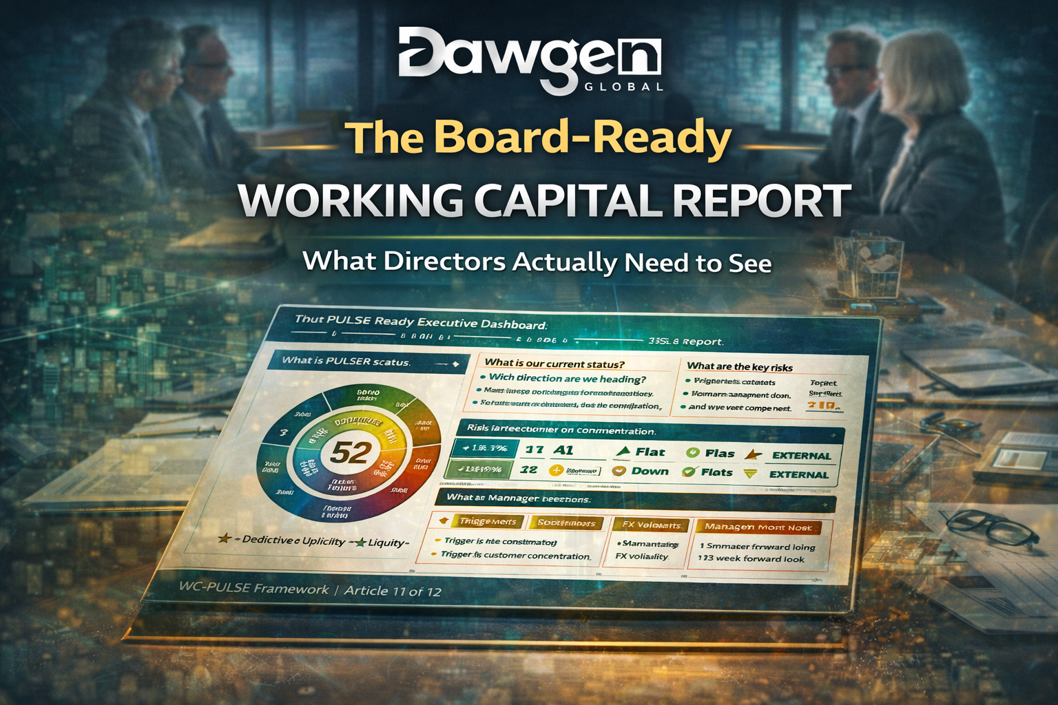
The One-Page PULSE Executive Dashboard
The four questions translate into a one-page board report with four clearly defined zones. The following template is the format we recommend for all PULSE implementations and the format used by the organisations profiled throughout this article series.
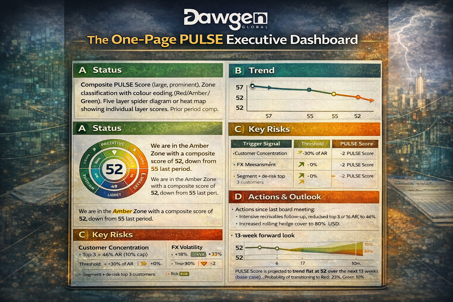
| Report Section | Content Specification |
| Section A: Status | Composite PULSE Score (large, prominent). Zone classification with colour coding (Red/Amber/Green). Five-layer spider diagram or heat map showing individual layer scores. Prior-period comparison. One sentence of narrative: “The organisation is in the [Zone] with a composite score of [X], [up/down/flat] from [Y] last period.” |
| Section B: Trend | Three-period trend line for the composite score. Directional arrows for each layer (improving/stable/deteriorating). Narrative highlighting the strongest-improving and weakest-declining layers with a brief explanation of what is driving each. Maximum: three sentences. |
| Section C: Key Risks | Two to three active trigger signals, each in a standardised block: Signal Name | Metric & Reading | Threshold | PULSE Score Impact | Management Response. No more than three signals. If no signals are active, state “No active trigger signals this period” – this positive confirmation is itself valuable governance information. |
| Section D: Actions & Outlook | Actions taken since last board meeting, keyed to previous risk signals, with measured impact. Actions planned for next period with expected impact. Forward-look: projected PULSE Score trajectory for the next 13 weeks under the base-case scenario. Zone-transition probability if applicable. |
The entire report fits on a single page. This is a deliberate design constraint, not a compromise. Every element that does not directly serve one of the four questions has been removed. There is no receivables-ageing table. No payables-breakdown chart. No inventory-by-category analysis. These are operational details that belong in the CFO’s management report and in the Working Capital Council’s agenda, not in the board pack. The board needs to govern, not to manage. The one-page format enforces that distinction.
Elevating the Governance Conversation
The one-page PULSE Executive Dashboard does more than improve the quality of information reaching the board. It fundamentally changes the nature of the governance conversation. In our experience implementing this reporting format, three shifts occur within the first two board cycles.
Shift 1: From Passive Receipt to Active Challenge
When the working-capital report was a collection of ratios, directors had nothing to challenge. The numbers were within target. What was there to discuss? The PULSE Dashboard, by contrast, provides the layered intelligence that enables informed questioning. A director can look at the spider diagram and ask why the U-Layer has declined while the P-Layer has improved. They can look at the trend arrows and ask whether the current trajectory will result in a zone change. They can look at the risk signals and ask whether the management response is adequate. The report invites challenge because it provides the context that makes challenge meaningful.
Shift 2: From Backward-Looking to Forward-Looking
Traditional working-capital reports are historical. They tell the board what happened last quarter. The PULSE Dashboard is forward-looking by design. Section D includes the projected PULSE Score trajectory for the next 13 weeks, drawn from the P-Layer’s scenario engine. This means the board is not merely assessing past performance – it is evaluating the organisation’s forward liquidity position and the management team’s preparedness for what is coming. If the forward projection shows a potential zone transition, the board can assess whether management’s pre-positioned response is adequate before the transition occurs. This is proactive governance, not reactive oversight.
Shift 3: From Metric Reporting to Strategic Narrative
The most important shift is narrative. The traditional report presents metrics. The PULSE Dashboard presents a story: where we are, where we are heading, what could go wrong, what we are doing about it, and what we need the board to understand. This narrative structure transforms working capital from a reporting line item into a strategic conversation. Directors begin to see working capital not as a treasury function but as a strategic capability that affects competitive positioning, growth capacity, and enterprise resilience. They begin asking questions not just about the numbers but about the strategy: “Should we be targeting a move from Amber to Green, and what would that require?” “Is our buffer policy appropriate given the macro environment?” “Are we capturing the repricing opportunity in the Green Zone, or are we leaving value on the table?”
These are the questions that boards should be asking. The PULSE Executive Dashboard creates the conditions for them to ask.
Embedding Working Capital in Enterprise Risk Management
The PULSE Executive Dashboard also creates a natural integration point between working-capital governance and the enterprise risk-management framework. In many organisations, working-capital risk is either absent from the enterprise risk register or represented as a single line item with a generic risk description and a static mitigation plan. The PULSE Framework provides the data to make this integration meaningful.
The composite PULSE Score and the zone classification can be mapped directly onto the enterprise risk register as a real-time risk indicator. A Red Zone classification elevates working-capital risk to the top tier of the register, triggering heightened board oversight and more frequent reporting. An Amber Zone classification maintains working capital as a monitored risk with standard reporting cadence. A Green Zone classification moves working capital to a lower tier, freeing board attention for other priorities while maintaining the automated monitoring that will signal if conditions change.
The trigger signals provide the leading indicators that enterprise risk management has traditionally lacked for working capital. Most enterprise risk registers describe working-capital risk in terms of lagging indicators – a liquidity shortfall that has already occurred, a credit-facility breach that has already been triggered. The PULSE system provides leading indicators – a forecast drift that signals an approaching shortfall, a supplier-concentration increase that signals growing ecosystem fragility, a macro-sensitivity spike that signals external pressure building. These leading indicators transform the enterprise risk-management treatment of working capital from reactive documentation to proactive management.
For organisations with formal risk-appetite statements, the PULSE Framework provides a natural metric for expressing working-capital risk appetite: “The board’s risk appetite is to maintain a composite PULSE Score above 45 at all times and above 55 as a sustained target. A score below 40 for two consecutive periods requires an extraordinary board briefing. A score below 35 triggers the CEO’s direct involvement in working-capital management alongside the CFO.” This kind of quantified, action-linked risk-appetite statement is only possible when the board has access to a scoring system that is comprehensive, reliable, and consistently maintained – which is precisely what the PULSE Framework delivers.
Five Mistakes That Undermine Board Working-Capital Reporting
Having reviewed hundreds of board working-capital reports across our advisory engagements, we have identified five recurring mistakes that prevent these reports from serving their governance purpose. Avoiding these mistakes is as important as implementing the PULSE template.
- Presenting ratios without context: A DSO of 52 days means nothing to a director who does not know the industry benchmark, the historical trend, or the working-capital impact of the number. Every metric in a board report must be accompanied by context: a comparison point (prior period, budget, industry median) and an implication statement (“this represents US$1.2 million in additional trapped receivables versus last quarter”).
- Reporting averages instead of distributions: The CCC is an average that masks concentration risk, payment-behaviour extremes, and ecosystem fragility. Board reports that rely on averages give directors a false sense of stability. The PULSE Dashboard replaces averages with layer scores that capture the full distribution of working-capital health across five dimensions.
- Omitting the forward look: A report that tells the board what happened last quarter but says nothing about what is coming next quarter is a history lesson, not a governance tool. The PULSE Dashboard’s 13-week forward projection ensures that the board is always looking through the windshield, not the rear-view mirror.
- Presenting risks without responses: Every risk signal presented to the board must be accompanied by the management action underway or proposed. A risk without a response creates anxiety without agency. The board cannot govern if they can see the problem but not the plan.
- Overwhelming with operational detail: The board does not need to see receivables ageing by customer, inventory by SKU category, or payables by supplier. These are management tools, not governance tools. The one-page constraint of the PULSE Executive Dashboard ensures that only governance-grade information reaches the boardroom.
UPGRADE YOUR BOARD REPORTING TODAY.
A ready-to-use PowerPoint and data-model package that transforms your working-capital board report into a one-page strategic narrative. Includes the four-section template, a sample spider diagram, trigger-signal formatting, and a forward-projection display – all pre-formatted with guidance notes for customisation to your organisation.
Dawgen Global is a full-spectrum advisory firm delivering transformation across Strategy, Finance, Operations, Technology, and Governance. Our Working Capital Advisory practice is powered by the proprietary WC-PULSE Framework™, designed to convert working-capital management from a reactive function into a strategic capability that drives shareholder value. We serve mid-market and large enterprises across the Caribbean, North America, and international markets.
Want help implementing the full PULSE governance framework behind the report? Email us : [email protected] |
The WC-PULSE Thought Leadership Series
Articles 1–10: CCC Blind Spots → Buffer vs. Reprice → 13-Week Crystal Ball → Supplier Ecosystem → Governance → Reprice Playbook → E-Layer → 90-Day Case Study → Caribbean CFO Guide → AI Cash Forecasting
Article 11: “The Board-Ready Working Capital Report: What Directors Actually Need to See” (You are here)
Coming Next – Article 12 (Series Finale): “Working Capital as a Weapon: How the Best-Run Companies Use PULSE to Outcompete” – The strategic case for working-capital excellence as a competitive weapon, with the PULSE Maturity Model and the Dawgen Global partnership model for organisations ready to transform.
About Dawgen Global
“Embrace BIG FIRM capabilities without the big firm price at Dawgen Global, your committed partner in carving a pathway to continual progress in the vibrant Caribbean region. Our integrated, multidisciplinary approach is finely tuned to address the unique intricacies and lucrative prospects that the region has to offer. Offering a rich array of services, including audit, accounting, tax, IT, HR, risk management, and more, we facilitate smarter and more effective decisions that set the stage for unprecedented triumphs. Let’s collaborate and craft a future where every decision is a steppingstone to greater success. Reach out to explore a partnership that promises not just growth but a future beaming with opportunities and achievements.
 Email: [email protected]
  Visit: Dawgen Global Website

 WhatsApp Global Number : +1 555-795-9071
Caribbean Office: +1876-6655926 / 876-9293670/876-9265210  WhatsApp Global: +1 5557959071
USA Office: 855-354-2447
Join hands with Dawgen Global. Together, let’s venture into a future brimming with opportunities and achievements

